Bhachat
Bhachat is a user-friendly e-wallet app designed for seamless transactions, budget management, and expense tracking all in one secure platform.
Industry
FinTech | B2C
Role
UI/UX Designer
Team
Solo
Duration
6 weeks
Approach
User-centered design
Tools
Figma, Figjam, Slack
Overview
Managing personal finances can feel overwhelming many users struggle to track spending, transfer money quickly, or trust digital platforms. Bhachat was created to address these needs through thoughtful design focused on clarity, security, and simplicity.
Problem Space
I started Bhachat after realizing how many people, including myself, struggle to manage their finances with existing digital tools. Many budgeting apps feel overly complex and lack trust. Even simple tasks like tracking expenses or sending money can be frustrating.
But this goes beyond bad UX when people can’t manage their money confidently, it leads to overspending, missed payments, and stress. I wondered: What if a financial app truly worked for everyday people? Something simple, secure, and genuinely helpful. That question sparked Bhachat.
Problem Statement
How might we create a secure, simple, and reliable way for users to manage their money, track expenses, and make quick transactions?
User Research & Key Insights
To understand what users truly need from an e-wallet app, I conducted interviews and surveys with 25 participants. My focus was on uncovering their main pain points, preferences, and security concerns.
What I learned:
- Security is the top priority. Everyone stressed how important two-factor authentication is for feeling safe.
- Tracking expenses accurately is a common struggle. Users want a clear way to see where their money goes.
- A clean, minimalistic design is preferred because it makes the app easier to use.
- Quick fund transfers are crucial—92% of participants said speed and simplicity in sending money matter most.
- Expense categorization is useful but ranks below security and transfer speed in importance.
- Many users want clearer information about how the app protects their financial data.
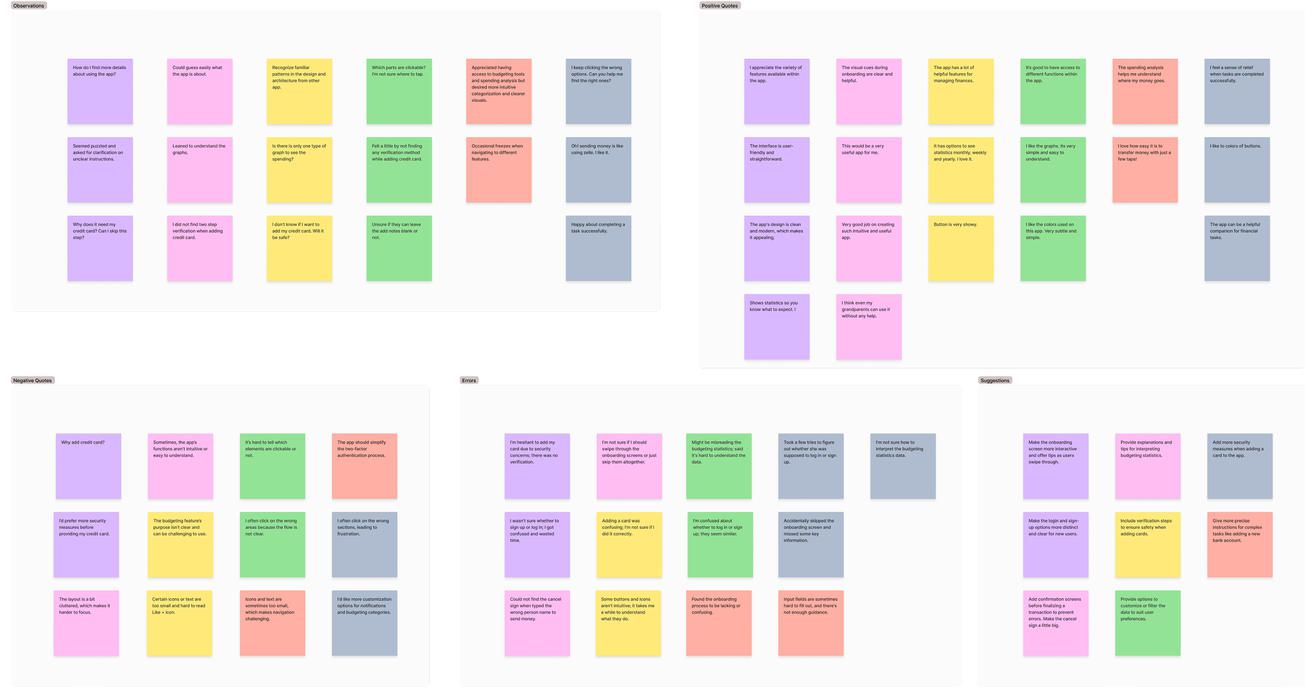
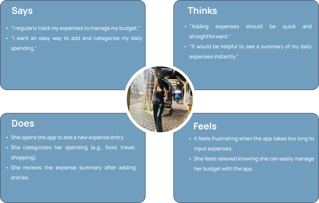
Affinity Map
Organizing Insights to Understand User Needs
To make sense of the research data and identify key themes, I created an affinity map that grouped user feedback and observations into meaningful categories. This process helped reveal patterns and prioritize features that truly matter to Bhachat users.
Design Process
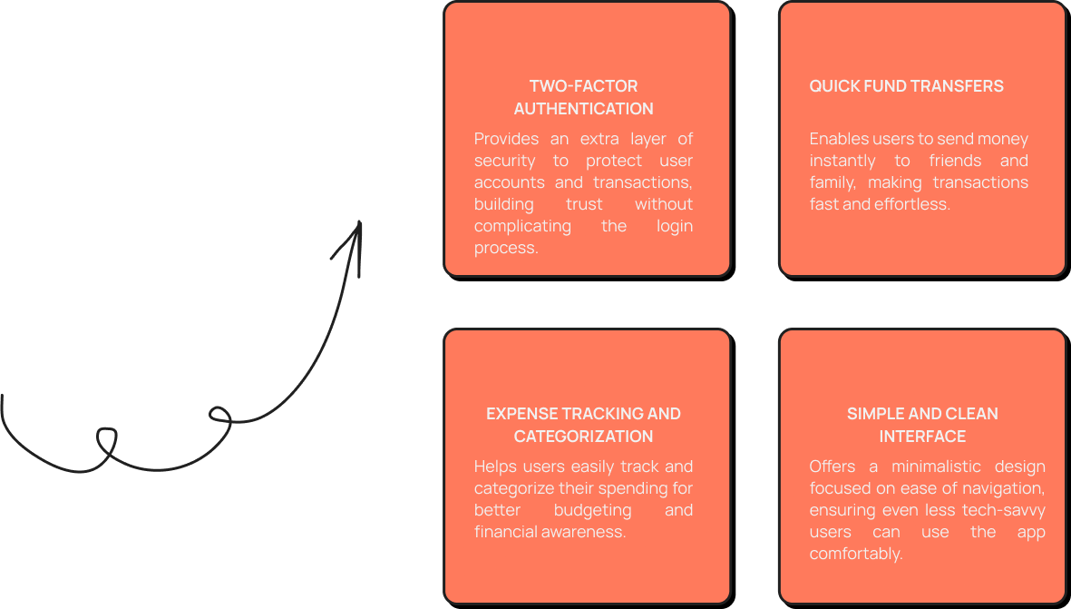
Proposed Features
After analyzing user feedback and research insights, I defined clear design goals to address the main user needs and challenges. These goals guided the development of Bhachat to ensure it is secure, user-friendly, and efficient.
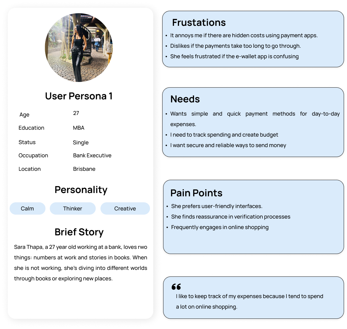
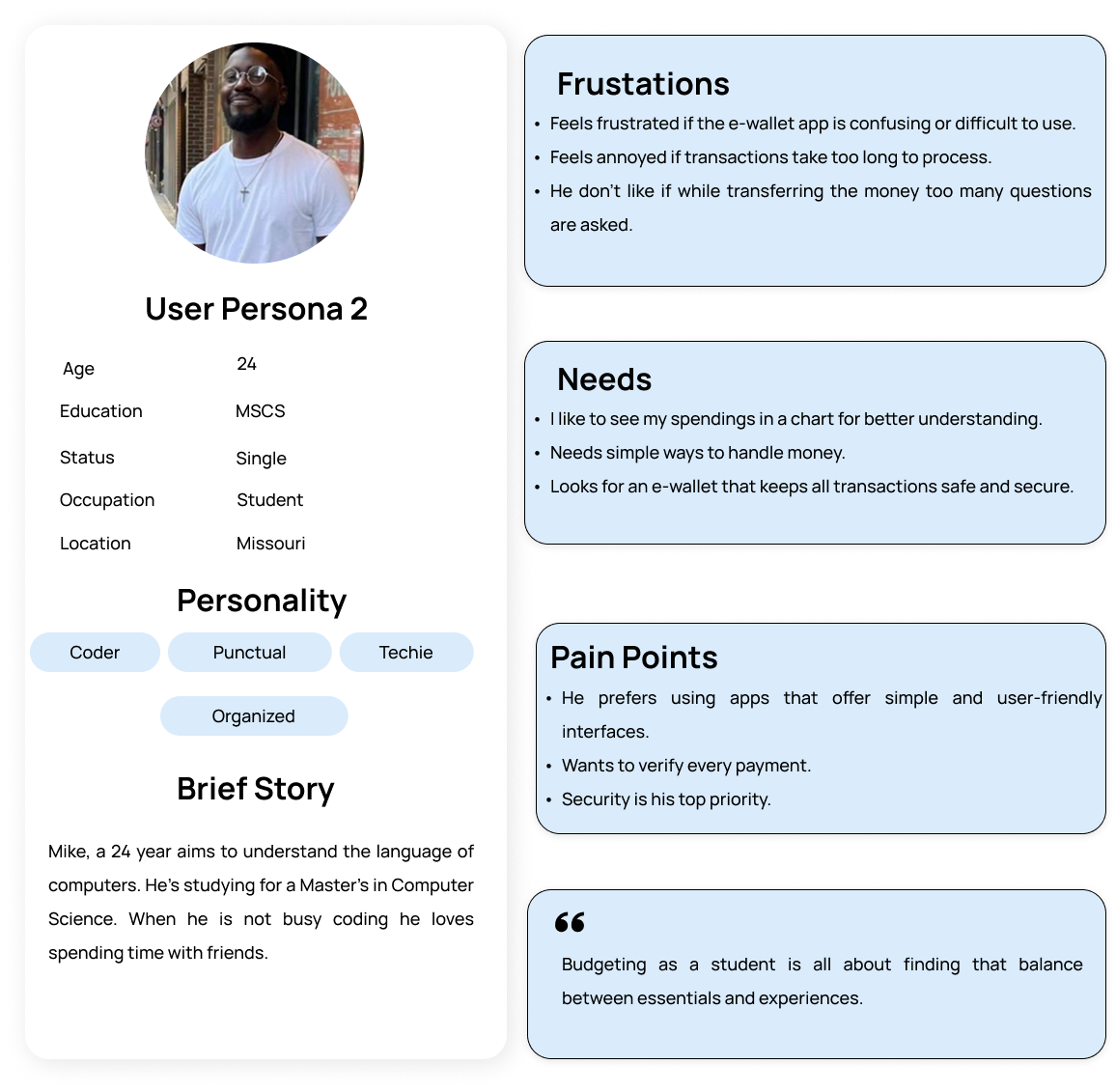
User Persona
After researching and analyzing user data, I created personas to guide the Bhachat app’s development. These personas helped me prioritize features like quick fund transfers and intuitive design, ensuring the app effectively meets diverse user needs and improves overall satisfaction.
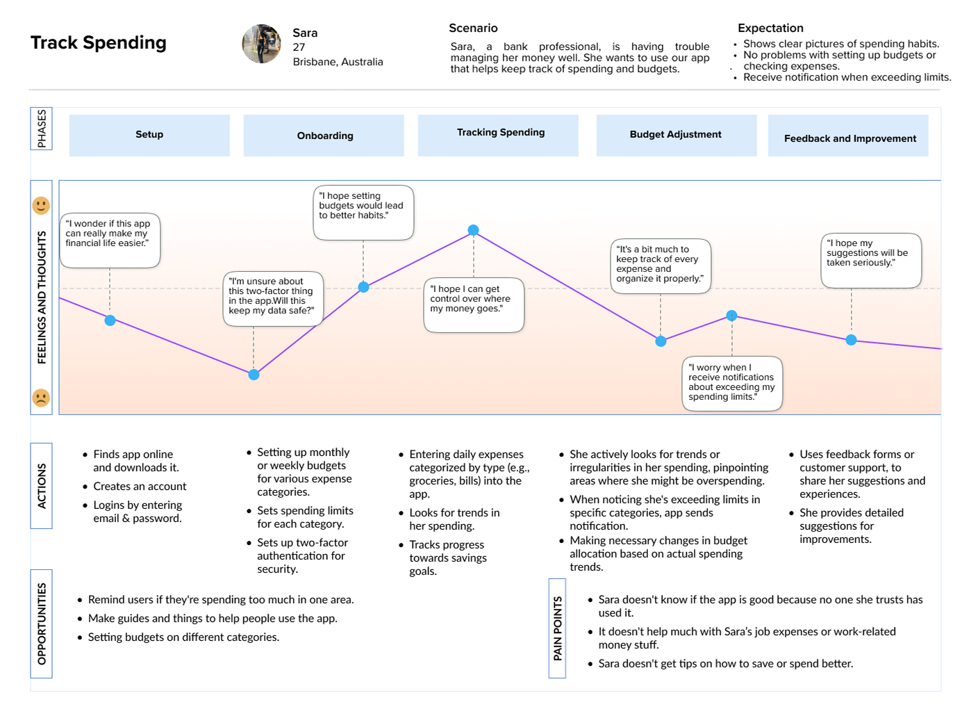
User Journey Map
User Flow
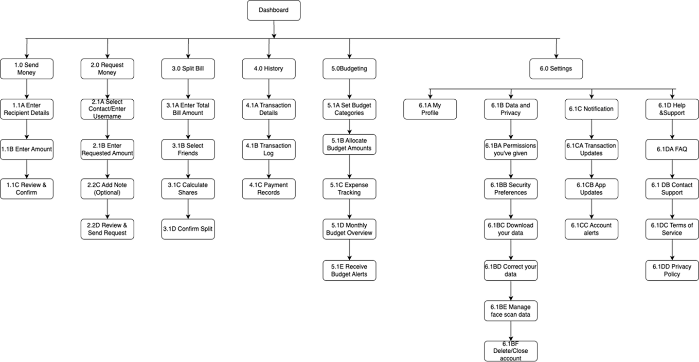
Information Architecture & Card Sorting
I conducted a closed card sorting exercise for our e-wallet app with a specific focus on five core categories: Send Money, Request Money, History, Budgeting, Settings. There were total of 5 participants. The results revealed clear user associations, leading to adjustments in the sitemap to better align with user expectations and improve the overall user flow.
Sitemap
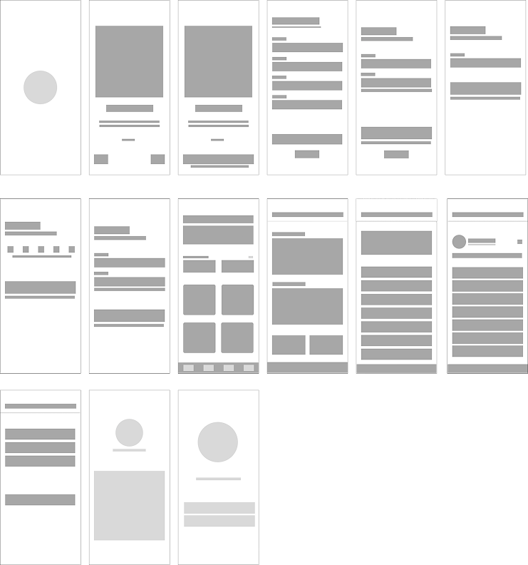
Low Fidelity Wireframes
After completing user research, I began designing low-fidelity wireframes by translating insights—especially from the card sorting exercise—into a simple visual layout. This helped prioritize user needs and ensured a clear, intuitive flow through the app’s core features. Building on that foundation, I then created mid-fidelity wireframes, which added more structure and detail to the layout, including spacing and element placement. These wireframes incorporated feedback from the initial designs to refine usability and served as a bridge between the basic sketches and the final high-fidelity design.
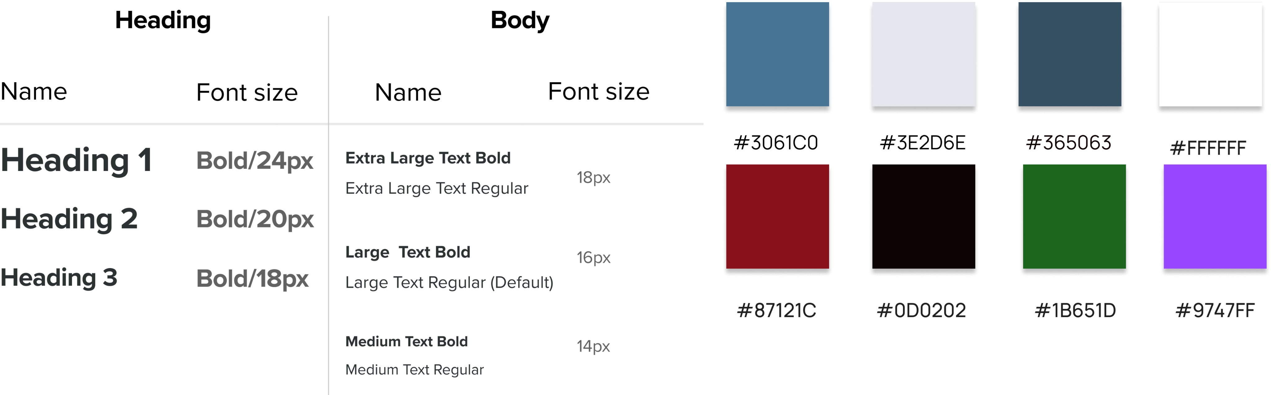
Typography and Colors
Font Family: Proxima Nova
Usability Testing
Once the Bhachat prototype was ready, I conducted moderated usability testing with 8 participants to assess the app’s effectiveness, ease of use, and overall experience. Participants were asked to perform 5 key tasks, including sending money and tracking expenses. Using Jakob Nielsen’s severity scale, affinity mapping, and a rainbow spreadsheet, I analyzed the feedback to uncover usability issues and prioritize improvements. This process helped identify major pain points and guided design refinements to improve clarity, feedback, and overall flow.
Issues & Solutions
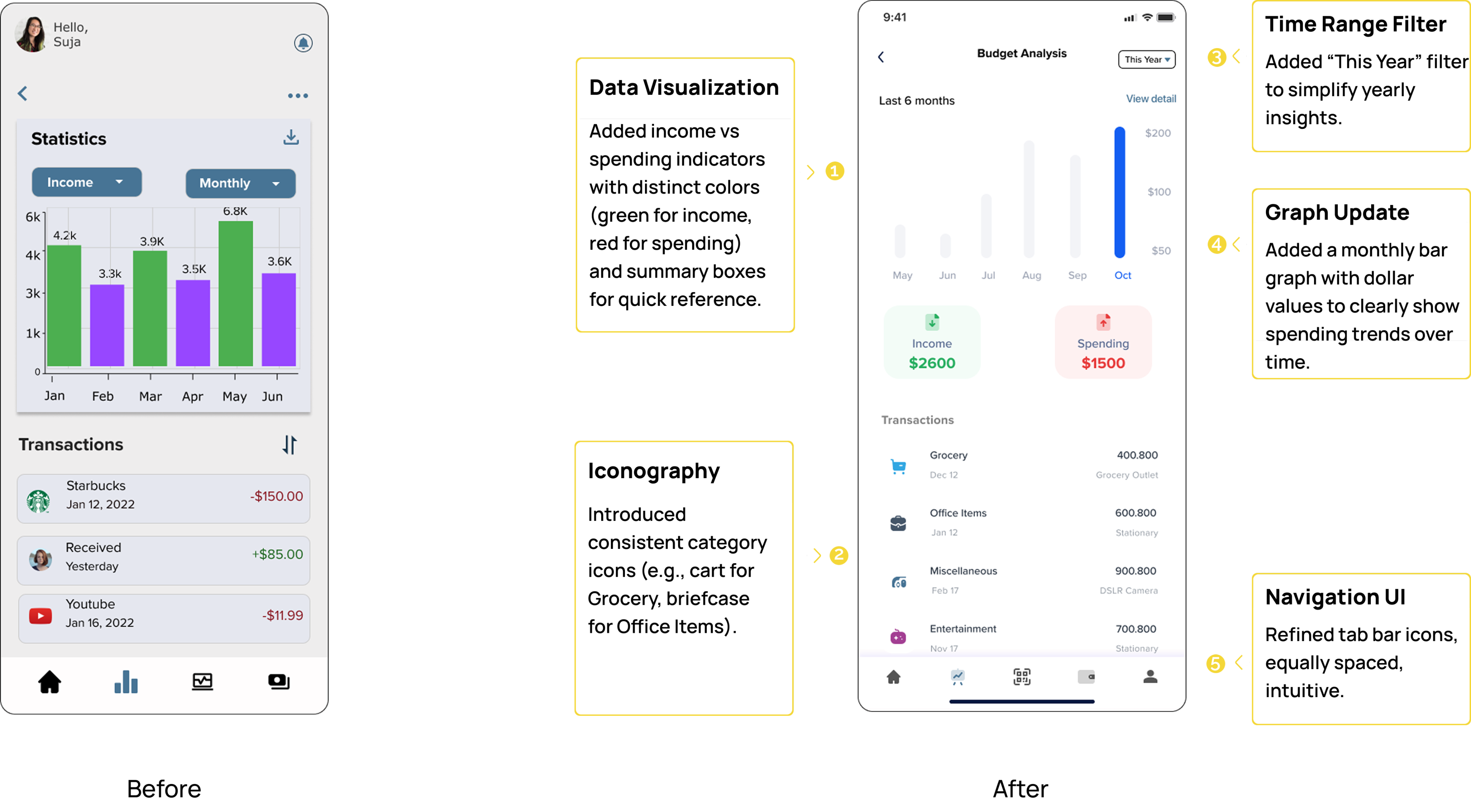
Issue: Users encountered multiple usability challenges , the dual bar chart was hard to interpret due to a lack of labels; the “This Year” time filter was often missed some transaction icons like “Miscellaneous” were unclear and the bottom navigation icons were confusing without text. These issues affected user understanding and ease of navigation.
Solution: I improved chart clarity by adding legends and value labels, made the time filter more prominent and interactive with better visual hierarchy, replaced vague icons with intuitive visuals and sub-labels, and enhanced navigation by adding descriptive text under each icon. These refinements led to a clearer, more user-friendly experience.
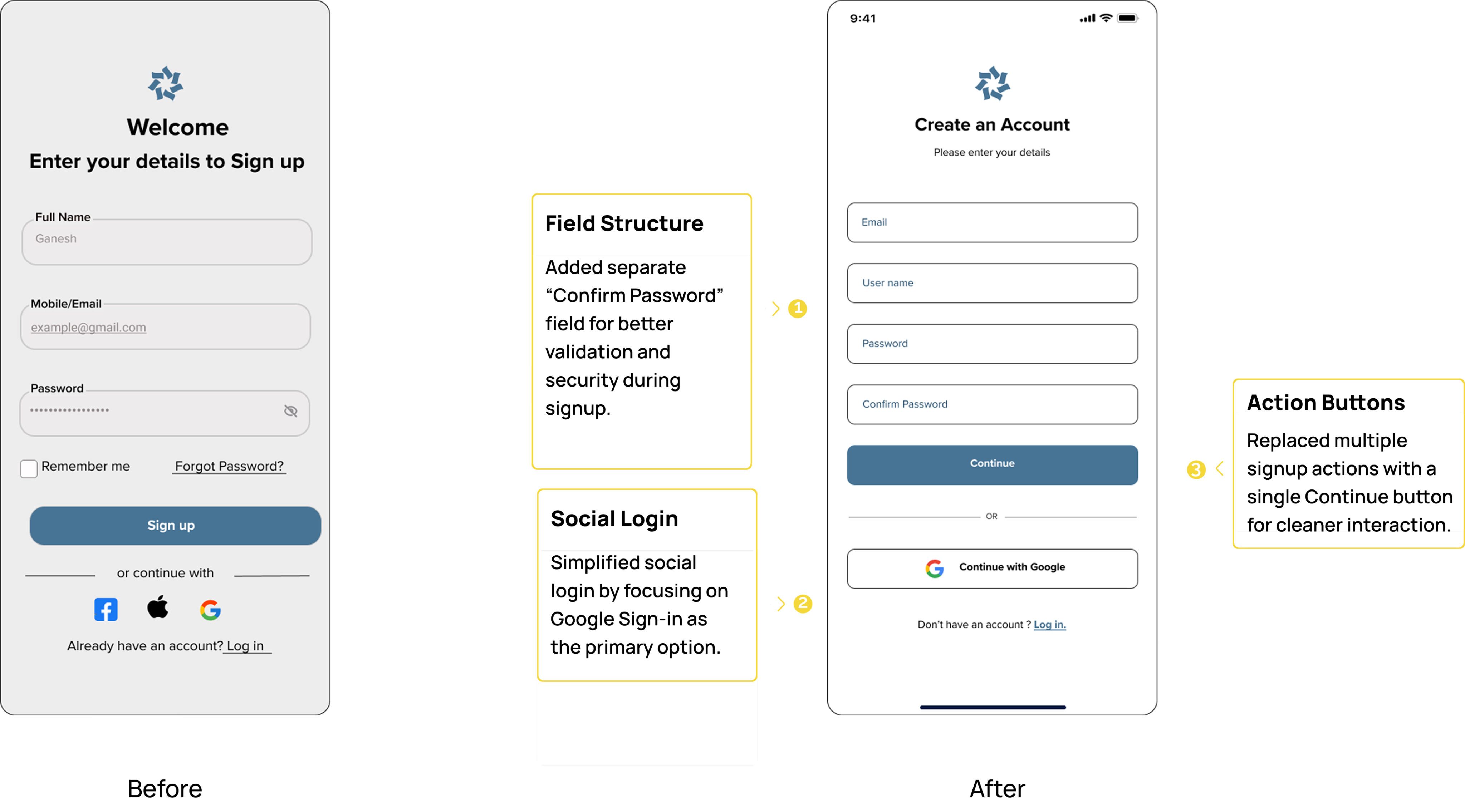
Issue: Users were confused by the inconsistency between the two sign-up screens. The left screen asked for “Full Name” and “Mobile/Email,” while the right screen required “Email” and “Username,” causing uncertainty about what credentials were required. Additionally, some users missed the social login options or overlooked the “Log in” link due to low visual hierarchy and spacing.
Solution:I standardized the input fields across both screens to ensure consistent onboarding expectations. Labels were aligned, and placeholder text was made more informative. I also enhanced the visibility of social login buttons by improving spacing and contrast, and made the "Log in" link more prominent to support returning users.
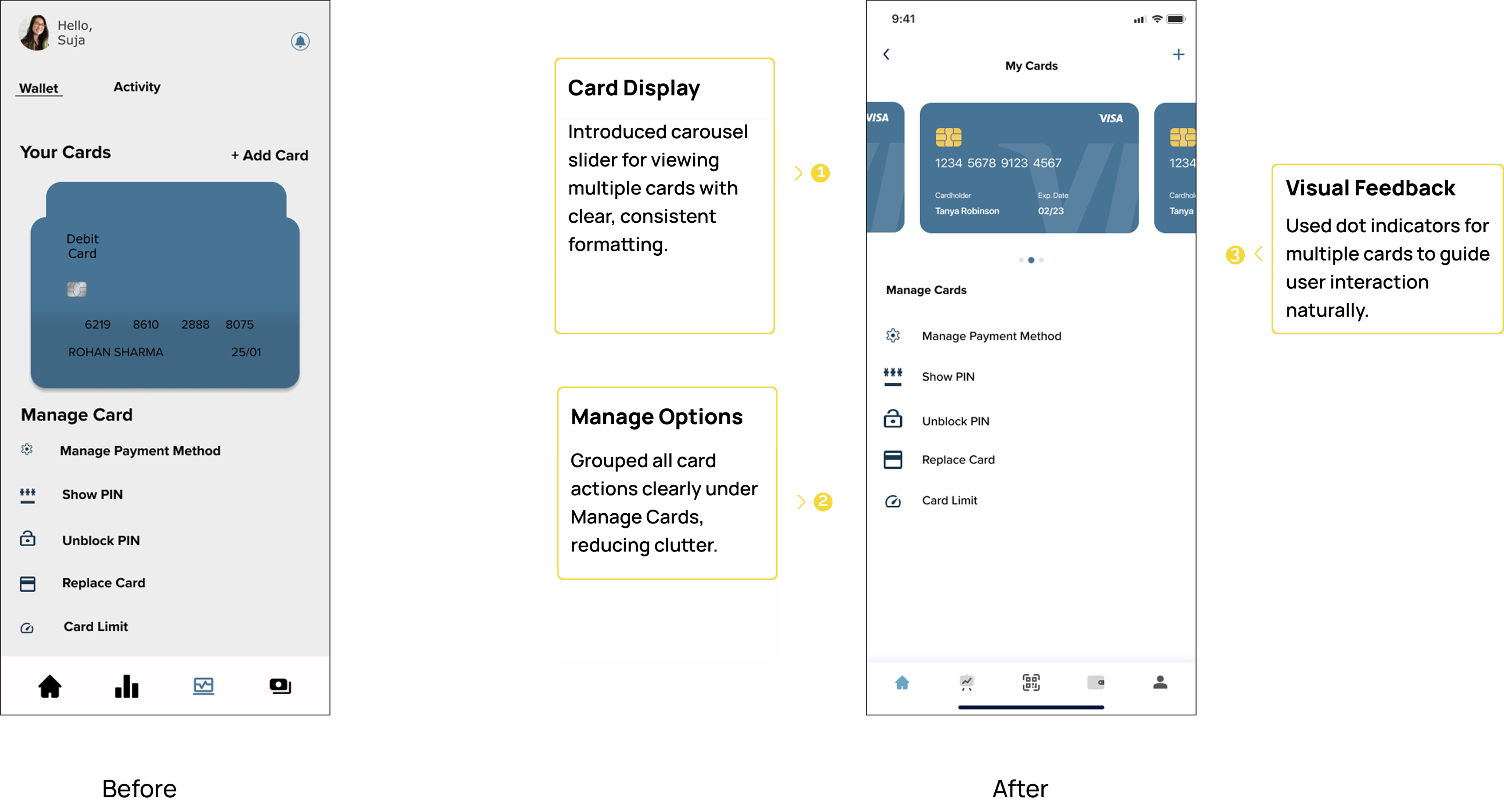
Issue: Users found it confusing to manage multiple cards, especially when only one card was prominently displayed at a time (left screen). During testing, users expressed the need to quickly switch between cards and manage them efficiently.
Solution:To resolve this, I redesigned the card section to display cards in a horizontal scrollable carousel (right screen), allowing users to swipe through their cards easily. This provided better visibility and control over multiple cards while maintaining a clean and user-friendly interface.
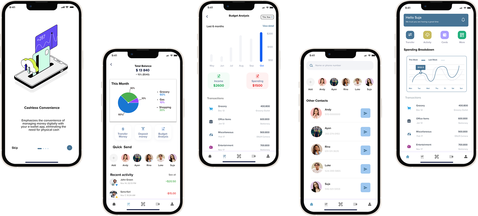
Final Design
Reflection
Working on Bhachat was a valuable experience, allowing me to explore user-centric design in the fintech space. I focused on creating a seamless and intuitive app that simplifies financial management, addresses user pain points, and enhances overall usability.
Next Steps
Moving forward, I aim to implement features like savings goals, enhanced budget analytics, and multi-language support. I also plan to conduct further usability tests to gather user feedback and refine the app's functionality for a more robust user experience.